> ## Documentation Index
> Fetch the complete documentation index at: https://help.chainbook.app/llms.txt
> Use this file to discover all available pages before exploring further.
# Dashboard
> Get a visual overview of your crypto activity with charts and metrics
The Dashboard provides at-a-glance insights into your transaction activity across all wallets and assets.
## Overview
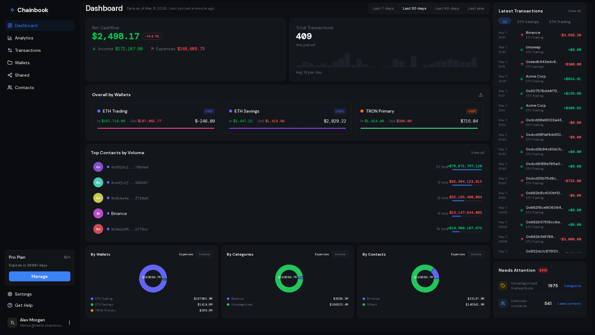 The dashboard displays:
* **Balance summary** - Total income, expenses, and net balance
* **Transaction charts** - Visual breakdowns by category, contact, and wallet
* **Recent activity** - Your latest transactions
* **Volume trends** - Daily transaction volume over time
## Balance Summary
The balance card shows your financial summary for the selected time period:
| Metric | Description |
| ------------ | ---------------------------------------- |
| **Income** | Total value of all incoming transactions |
| **Expenses** | Total value of all outgoing transactions |
| **Balance** | Net difference (Income - Expenses) |
Balance represents the net flow during the selected period, not your current wallet balance.
### Date Range Selection
Change the time period to view different summaries:
1. Click the date range selector
2. Choose a preset or custom range:
* Today
* Last 7 days
* Last 30 days
* This month
* This year
* Custom range
3. Dashboard updates with the new data
Use "This month" for monthly financial reviews or "This year" for annual tax preparation.
## Charts
The dashboard includes several visualization options.
### Chart by Categories
The dashboard displays:
* **Balance summary** - Total income, expenses, and net balance
* **Transaction charts** - Visual breakdowns by category, contact, and wallet
* **Recent activity** - Your latest transactions
* **Volume trends** - Daily transaction volume over time
## Balance Summary
The balance card shows your financial summary for the selected time period:
| Metric | Description |
| ------------ | ---------------------------------------- |
| **Income** | Total value of all incoming transactions |
| **Expenses** | Total value of all outgoing transactions |
| **Balance** | Net difference (Income - Expenses) |
Balance represents the net flow during the selected period, not your current wallet balance.
### Date Range Selection
Change the time period to view different summaries:
1. Click the date range selector
2. Choose a preset or custom range:
* Today
* Last 7 days
* Last 30 days
* This month
* This year
* Custom range
3. Dashboard updates with the new data
Use "This month" for monthly financial reviews or "This year" for annual tax preparation.
## Charts
The dashboard includes several visualization options.
### Chart by Categories
 Shows how your transactions are distributed across categories:
* Each slice represents a category
* Size indicates total transaction value
* Hover for exact amounts
**Use cases:**
* See which expense categories are largest
* Identify revenue sources
* Spot uncategorized transactions
### Chart by Contacts
Shows transaction volume per contact/address:
* Top contacts by transaction value
* Identifies your most frequent transaction partners
* Hover for contact names and totals
**Use cases:**
* Track payments to/from specific addresses
* Identify major business partners
* Review customer payment activity
### Chart by Wallets
Shows activity distribution across your wallets:
* Compare transaction volume between wallets
* Identify most active wallets
* Track wallet growth over time
**Use cases:**
* Compare business vs. personal activity
* Monitor client wallet activity
* Balance attention across wallets
## Recent Activity
The Recent Activity section shows your latest transactions:
| Column | Description |
| ------- | --------------------------------------- |
| Time | When the transaction occurred |
| Amount | Value and direction (in/out) |
| Wallet | Which wallet the transaction belongs to |
| From/To | Other party in the transaction |
Click any transaction to view full details in the Transactions page.
### Quick Actions
From recent activity, you can:
* Click to view transaction details
* See the contact name if the address is in your contact book
* Quickly identify unusual activity
## Daily Volume Chart
Shows how your transactions are distributed across categories:
* Each slice represents a category
* Size indicates total transaction value
* Hover for exact amounts
**Use cases:**
* See which expense categories are largest
* Identify revenue sources
* Spot uncategorized transactions
### Chart by Contacts
Shows transaction volume per contact/address:
* Top contacts by transaction value
* Identifies your most frequent transaction partners
* Hover for contact names and totals
**Use cases:**
* Track payments to/from specific addresses
* Identify major business partners
* Review customer payment activity
### Chart by Wallets
Shows activity distribution across your wallets:
* Compare transaction volume between wallets
* Identify most active wallets
* Track wallet growth over time
**Use cases:**
* Compare business vs. personal activity
* Monitor client wallet activity
* Balance attention across wallets
## Recent Activity
The Recent Activity section shows your latest transactions:
| Column | Description |
| ------- | --------------------------------------- |
| Time | When the transaction occurred |
| Amount | Value and direction (in/out) |
| Wallet | Which wallet the transaction belongs to |
| From/To | Other party in the transaction |
Click any transaction to view full details in the Transactions page.
### Quick Actions
From recent activity, you can:
* Click to view transaction details
* See the contact name if the address is in your contact book
* Quickly identify unusual activity
## Daily Volume Chart
 The daily volume chart shows transaction activity over time:
* X-axis: Days in the selected period
* Y-axis: Transaction volume (count or value)
* Bars: Daily totals
**Insights you can gain:**
* Identify busy vs. quiet periods
* Spot unusual activity spikes
* Track trends over time
## Filtering Dashboard Data
### By Wallet
Filter the entire dashboard to show only one wallet's data:
1. Click the **Wallet** dropdown at the top
2. Select a specific wallet
3. All charts and metrics update to show only that wallet
Select "All Wallets" to return to the combined view.
### By Date Range
All dashboard data respects the selected date range:
1. Choose your date range from the selector
2. Balance, charts, and recent activity update
3. Compare different periods by changing the range
## Dashboard Best Practices
### Regular Reviews
Set a weekly or monthly habit of reviewing your dashboard to stay on top of your crypto activity.
**Weekly review checklist:**
* [ ] Check recent activity for unexpected transactions
* [ ] Review balance summary for the week
* [ ] Ensure all transactions are categorized
**Monthly review checklist:**
* [ ] Compare this month to last month
* [ ] Review category distribution
* [ ] Identify trends in contact activity
### Identifying Issues
The dashboard helps you spot potential issues:
| Observation | Possible Issue |
| ------------------------------------------- | -------------------------------- |
| Large uncategorized slice in category chart | Transactions need categorization |
| Unexpected spike in daily volume | Unusual activity to investigate |
| Unknown address in top contacts | May need to add to contact book |
| Imbalanced income/expenses | Review cash flow management |
### Using for Reporting
Export dashboard data for reports:
1. Set the desired date range
2. Filter to specific wallet if needed
3. Use the **Export** option in Overall by Wallets
4. Download CSV for external reporting
## Overall by Wallets
The Overall by Wallets view provides a summary table:
| Column | Description |
| -------- | ----------------------------- |
| Wallet | Wallet name |
| Income | Total incoming for the period |
| Expenses | Total outgoing for the period |
| Balance | Net for the period |
### Exporting Wallet Summary
Find the Overall by Wallets section on the dashboard.
Ensure the date range covers the period you want to export.
Click the **Export** button to download a CSV summary.
The exported CSV is useful for:
* Sharing wallet summaries with stakeholders
* Tax preparation
* Financial reconciliation
## Frequently Asked Questions
The dashboard shows **flow** (income minus expenses) for a period, not your current wallet balance. Your wallet balance also includes:
* Activity before the selected period
* Tokens not tracked by Chainbook
* Network fees and gas
Currently, the dashboard layout is fixed. All users see the same charts and metrics. We're considering customization options for future updates.
Dashboard data updates whenever new transactions are synced, typically within 5 minutes of blockchain confirmation.
You can share dashboard access by inviting team members to your wallets. They'll see the same dashboard data for shared wallets.
The daily volume chart shows transaction activity over time:
* X-axis: Days in the selected period
* Y-axis: Transaction volume (count or value)
* Bars: Daily totals
**Insights you can gain:**
* Identify busy vs. quiet periods
* Spot unusual activity spikes
* Track trends over time
## Filtering Dashboard Data
### By Wallet
Filter the entire dashboard to show only one wallet's data:
1. Click the **Wallet** dropdown at the top
2. Select a specific wallet
3. All charts and metrics update to show only that wallet
Select "All Wallets" to return to the combined view.
### By Date Range
All dashboard data respects the selected date range:
1. Choose your date range from the selector
2. Balance, charts, and recent activity update
3. Compare different periods by changing the range
## Dashboard Best Practices
### Regular Reviews
Set a weekly or monthly habit of reviewing your dashboard to stay on top of your crypto activity.
**Weekly review checklist:**
* [ ] Check recent activity for unexpected transactions
* [ ] Review balance summary for the week
* [ ] Ensure all transactions are categorized
**Monthly review checklist:**
* [ ] Compare this month to last month
* [ ] Review category distribution
* [ ] Identify trends in contact activity
### Identifying Issues
The dashboard helps you spot potential issues:
| Observation | Possible Issue |
| ------------------------------------------- | -------------------------------- |
| Large uncategorized slice in category chart | Transactions need categorization |
| Unexpected spike in daily volume | Unusual activity to investigate |
| Unknown address in top contacts | May need to add to contact book |
| Imbalanced income/expenses | Review cash flow management |
### Using for Reporting
Export dashboard data for reports:
1. Set the desired date range
2. Filter to specific wallet if needed
3. Use the **Export** option in Overall by Wallets
4. Download CSV for external reporting
## Overall by Wallets
The Overall by Wallets view provides a summary table:
| Column | Description |
| -------- | ----------------------------- |
| Wallet | Wallet name |
| Income | Total incoming for the period |
| Expenses | Total outgoing for the period |
| Balance | Net for the period |
### Exporting Wallet Summary
Find the Overall by Wallets section on the dashboard.
Ensure the date range covers the period you want to export.
Click the **Export** button to download a CSV summary.
The exported CSV is useful for:
* Sharing wallet summaries with stakeholders
* Tax preparation
* Financial reconciliation
## Frequently Asked Questions
The dashboard shows **flow** (income minus expenses) for a period, not your current wallet balance. Your wallet balance also includes:
* Activity before the selected period
* Tokens not tracked by Chainbook
* Network fees and gas
Currently, the dashboard layout is fixed. All users see the same charts and metrics. We're considering customization options for future updates.
Dashboard data updates whenever new transactions are synced, typically within 5 minutes of blockchain confirmation.
You can share dashboard access by inviting team members to your wallets. They'll see the same dashboard data for shared wallets.